Photo Gallery for a Website How to Build and Embed It
Learn how to create a photo gallery for a website that loads fast, looks great on mobile, and is easy to embed — from plugins to branded upload galleries.
A lot of people arrive at the same point with galleries. They've got the photos. They've got a website. What they don't have is a gallery that feels intentional.
Sometimes it's a photographer staring at a portfolio page with far too many images in one long scroll. Sometimes it's a venue team trying to post event recaps without making the site sluggish. Sometimes it's a couple, planner, or conference organizer who needs guests to upload photos live and then wants those same photos to become a shareable gallery afterward.
A photo gallery for a website isn't just a grid. It affects how people browse, what they trust, how fast the page loads, and whether anyone can use it on a phone, keyboard, or screen reader. That's where most gallery advice falls short. It covers the pretty part and skips the parts that make the gallery work.
Table of Contents
- Why Your Website Needs a Thoughtful Photo Gallery
- Choosing the Right Way to Build Your Gallery
- How to Build and Embed a Responsive Gallery That Works Everywhere
- Creating a Branded Event Gallery Guests Can Upload To and Share From
- Making Your Gallery Fast Accessible and Search Friendly
- Your Next Gallery Done Right
Why Your Website Needs a Thoughtful Photo Gallery
A planner sends out an event link at 4 p.m. By 9 p.m., guests are scanning a QR code, uploading photos from their phones, and refreshing the same gallery to see new images appear. The next morning, that gallery is no longer just an event tool. It is social proof, a recap page, and often the first thing future clients judge your brand by.
That is why gallery decisions deserve more care than “add a grid and call it done.”
I've seen beautiful photography lose impact because the gallery around it was poorly planned. Thumbnails loaded too slowly. Lightboxes trapped keyboard users. Mobile layouts cropped faces. Hundreds of images were dumped onto one page with no grouping, no pacing, and no clear next step. Visitors rarely say, “your gallery UX is weak.” They leave.
The web has treated images as core content for a long time. One commonly cited milestone is the first photo posted to the web in 1992, noted in this web history reference. Since then, galleries have shifted from a nice extra to standard site infrastructure across portfolios, hospitality sites, product pages, and event recaps.
A thoughtful gallery does several jobs at once. It presents images in a way people can browse. It protects page speed. It gives search engines usable context. It makes sharing easy without turning the page into a cluttered feed. For live events, it also handles collection and publishing in one place, which is a very different job from a static portfolio grid.
Structure matters more than volume.
For a photographer, that usually means tighter editing and clearer categories. For a venue or planner, it means showing the flow of a real event instead of uploading every decent frame from the night. For a brand running conferences or community events, it can mean one gallery link that starts as a live upload hub and ends as a polished recap guests can revisit and share.
That shift from “gallery as display” to “gallery as workflow” is easy to miss, and it changes what good looks like. A wedding venue may need elegant browsing and strong visual storytelling. A conference team may need moderation, guest uploads, duplicate control, and fast mobile performance because the gallery is active while the event is still happening. Those are different requirements, even if both pages are mostly photos.
Trust is the payoff. People book what they can verify.
A strong gallery shows what your work looks like in real conditions, with real people, in real spaces. It answers questions before the contact form does. If you want a clean example from hospitality, view the Merrill gallery. The page keeps the focus on the images and supports the venue instead of competing with it.
Different galleries also carry different UX responsibilities:
- Portfolio galleries need careful editing, clear grouping, and consistent image quality.
- Client proofing galleries need privacy controls, simple selection, and low-friction review.
- Live event galleries need QR-friendly access, uploads from guests, moderation, and the ability to publish back to the same link.
- Product galleries need accurate detail, predictable zoom, and image handling that does not slow the page down.
A thoughtful gallery earns its space on the site because it helps people decide, share, and act. That is a bigger job than filling a page with photos.
Choosing the Right Way to Build Your Gallery
A venue owner usually notices the wrong gallery setup after launch, not during design. The page looks fine on day one, then image uploads get messy, mobile performance drops, the editor stops updating it, or guests have no clean way to add their own photos after an event.
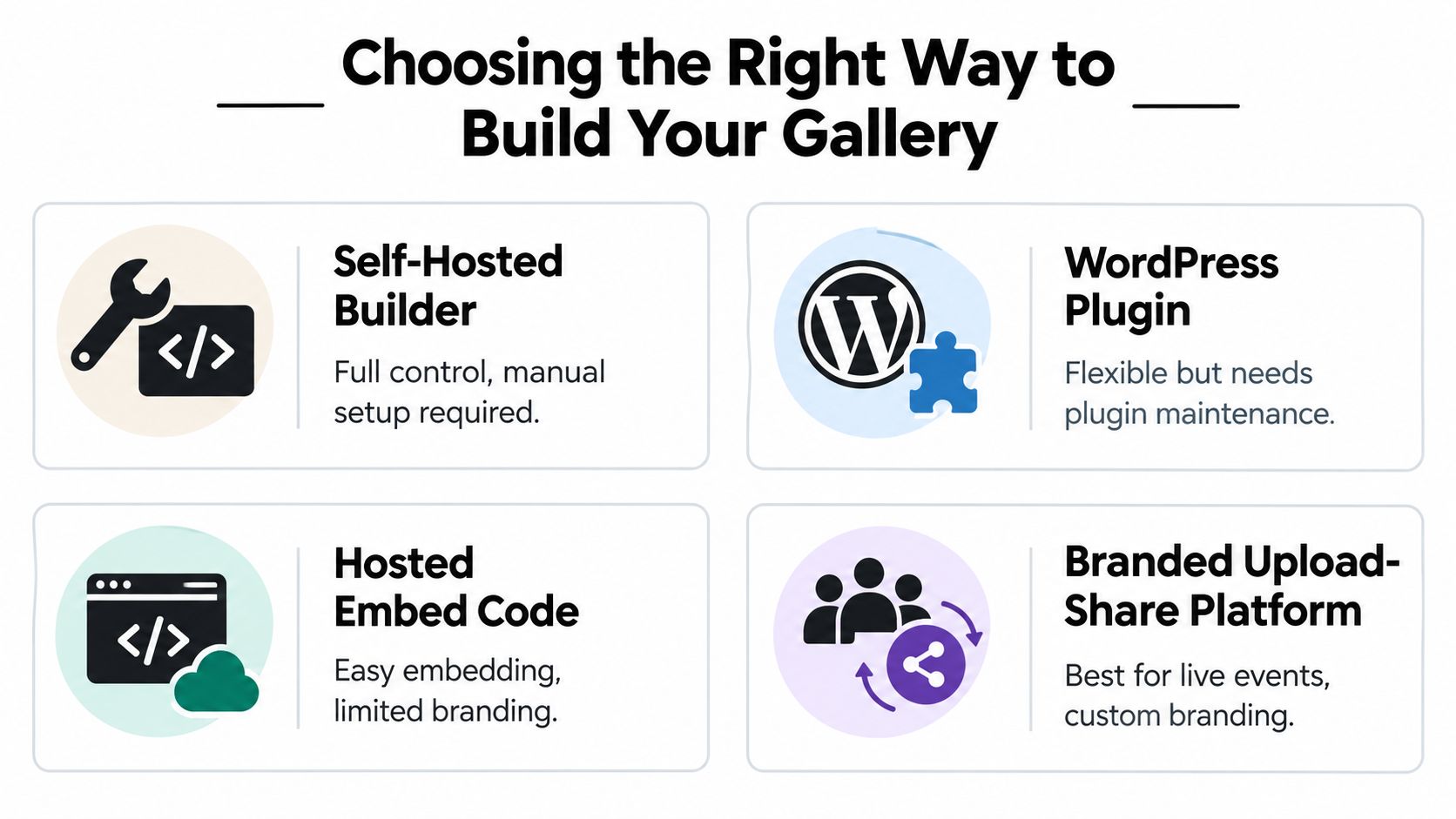
There are four common ways to build a photo gallery for a website. Each one fits a different operational need, and the right choice depends less on visual taste than on who updates the gallery, how often it changes, and whether the page is only for viewing or also for collecting photos.
Gallery Build Options Compared
| Build Method | Best For | Control and Maintenance | Sharing and Collection |
|---|---|---|---|
| Self-Hosted Builder | Custom websites, design-heavy portfolios, teams with front-end support | Highest control. You manage layout, scripts, image handling, and updates | Good for display. Weak for live guest uploads unless you build extra workflow |
| WordPress Plugin | Marketing sites, portfolios, brochure sites already on WordPress | Flexible, but plugin updates and conflicts need attention | Good display options. Collection features vary widely |
| Hosted Embed Code | Fast launch, simple recaps, teams that don't want much setup | Lower maintenance. Less branding and behavior control | Easy sharing. Collection depends on platform |
| Branded Upload-Share Platform | Weddings, parties, conferences, festivals, community events | Moderate control with less technical overhead | Strong for guest uploads, moderation, and publishing back to one link |
When custom is worth it
A self-hosted gallery makes sense when the gallery is part of the site's product experience, not just a content block.
Use this route when spacing, typography, transitions, filtering, and image behavior all need to match an existing design system exactly. It also gives full control over markup, loading strategy, keyboard behavior, and how the gallery responds across breakpoints. That matters on high-end portfolio sites and on brand teams that care about every interaction.
The trade-off is ownership. Someone still has to handle image prep, responsive image sets, lightbox behavior, regression testing, and browser quirks. If that work does not have a clear owner, custom galleries age badly.
When plugins are the practical choice
WordPress plugins are a good fit when a site owner needs to update galleries without calling a developer.
That convenience is the reason they remain common. A solid plugin can cover albums, captions, lightboxes, basic filtering, and editor-friendly uploads in one place. For brochure sites, service businesses, and standard portfolios, that is often enough.
The risk is stacking features until the gallery becomes the heaviest part of the page.
I have seen sites running a page builder, a slider, a lightbox plugin, and a gallery plugin all trying to control the same images. The result is usually duplicate scripts, inconsistent spacing, layout bugs, and slower mobile rendering. One well-chosen plugin is maintainable. Four overlapping ones are not.
When embeds save time
Hosted embeds work well when speed of launch matters more than deep front-end control.
They are useful for recap pages, campaign microsites, temporary event pages, or teams that want the gallery live in an afternoon. Paste the code, set the container, test it on mobile, and publish. That is a valid choice if the gallery supports the page instead of carrying the brand experience on its own.
The downside is constraint. Styling hooks are limited, accessibility behavior is only as good as the provider, and some embeds feel disconnected from the rest of the site. Before choosing one, check how it handles resizing, captions, focus states, and touch interaction.
When upload and sharing matter more than layout polish
This is the option many gallery roundups barely cover, even though it solves a very different problem.
For weddings, school events, conferences, fundraisers, and festivals, the hard part is usually getting photos from guests into one place while the event is still happening. A standard portfolio gallery does not handle that well. An upload-share platform does, because the gallery acts as a live collection link. Guests scan a QR code, upload from their phones, and view approved photos in the same place.
That changes what "build method" means.
You are not only choosing a layout. You are choosing moderation rules, upload limits, privacy settings, approval flow, and whether new photos can publish back to the same gallery URL without confusing guests. Platforms built for that workflow, including tools such as EventUploader, are often the better fit when participation matters as much as presentation.
Choose based on the job the gallery has to do. If the page only needs to showcase finished work, optimize for design control and easy editing. If the gallery needs to collect, review, and republish guest photos during a live event, choose the workflow that handles that cleanly first.
How to Build and Embed a Responsive Gallery That Works Everywhere
A responsive gallery isn't hard to build. What trips people up is skipping the unglamorous decisions that determine whether the result feels smooth or fragile.
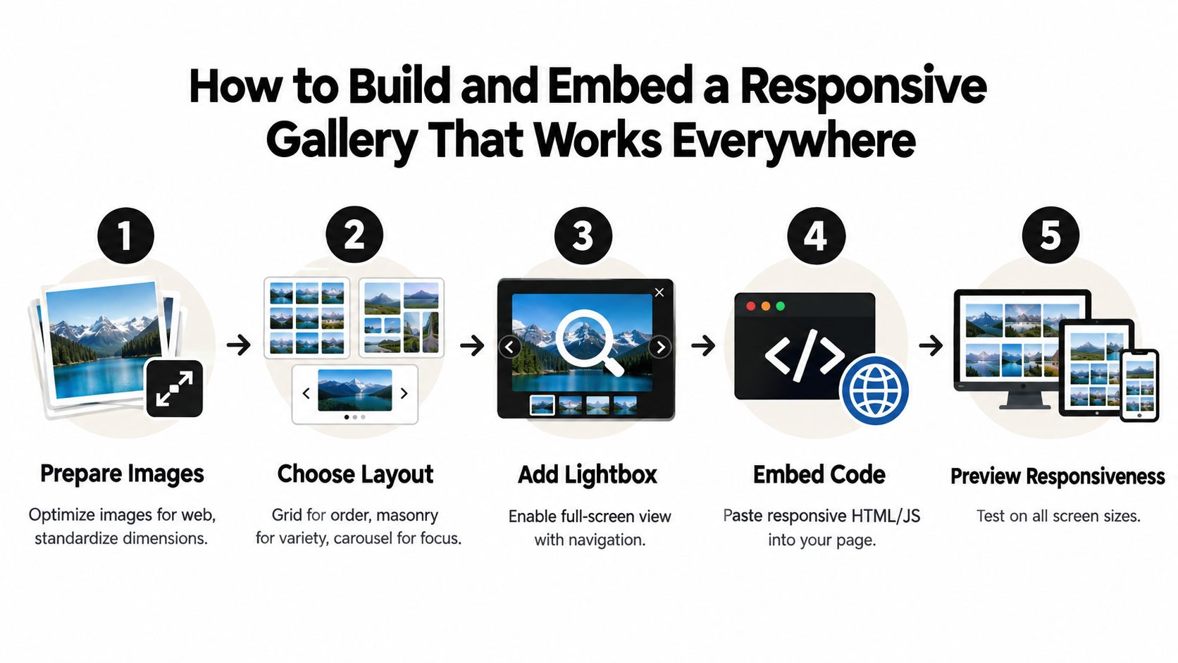
Start with image prep
Most gallery problems begin before the first line of embed code.
Prepare a clean set of images with consistent cropping logic. That doesn't mean every file must share identical dimensions, but the presentation should feel deliberate. If half the images are tight verticals, a few are panoramic, and the rest are random exports from different tools, the layout has to work far too hard.
Google's image guidance is useful here because it joins performance, discoverability, and usability in one place. It emphasizes meaningful image description, responsive images, lazy loading, and modern formats such as WebP and AVIF in Google Images documentation. That's the practical baseline now.
A solid prep checklist looks like this:
- Choose modern formats: Export to WebP or AVIF where your workflow supports it.
- Keep originals elsewhere: The website gallery should use web-ready files, not your master archive.
- Write filenames with intent: Clean names help your own organization and make future updates easier.
- Decide the crop strategy early: Uniform thumbnails with looser full-size images usually work better than random crops throughout.
Pick a layout that matches the content
Layout is not just style. It controls pacing.
A regular grid works best when order matters. Product images, venue showcases, and formal portfolio categories all benefit from a grid because visitors can compare images quickly.
Masonry can work well for editorial or mixed-aspect photography, but it's easy to overdo. If every thumbnail is a different height, the page can feel restless. Use masonry when variation helps the work, not when it's masking weak curation.
A carousel is useful for a small, focused set of featured images. It's not a replacement for a full gallery. Carousels hide content by default, which means they're better as a highlight reel than a browsing system.
A gallery should make selection easier. If the layout makes people hunt, it's the wrong layout.
Add lightbox behavior without making the page heavy
People still expect to tap a thumbnail and see a larger view. That part is straightforward. The trade-off is script weight and interaction quality.
Lightboxes work best when they do a few things well:
- Keep navigation obvious: Previous, next, close, and caption behavior should be immediately clear.
- Avoid animation overload: Fancy transitions age fast and often feel slower than a simple fade.
- Respect touch and keyboard input: Don't build only for mouse users.
- Preserve context: Users should be able to close the lightbox and return to roughly the same point in the page.
If you're building the interface yourself, utility-first tooling can keep the front-end lean. For teams that want to build UI with Tailwind CSS, it's a practical way to shape responsive grids, spacing, and modal states without writing a large custom stylesheet from scratch.
Embed methods that work in the real world
The embed method depends on the platform, not on what's theoretically pure.
Plain HTML sites
On a simple hand-coded site, use semantic markup for the gallery container, responsive image tags, and a minimal lightbox script. This gives you the most control. It also puts all responsibility on you.
WordPress sites
Use a gallery block, shortcode, or plugin only if the editing experience is worth the extra layer. Keep the plugin count tight. A gallery shouldn't require three plugins and a page builder module to function.
Squarespace and similar builders
Use the native gallery section if it's adequate. If not, embed a hosted gallery in a code block and style the container around it instead of fighting the platform's defaults.
For a practical example of the live event model, this guide on live photo gallery workflows is useful because it focuses on the upload-and-publish loop rather than just front-end presentation.
Preview like a user, not like the site owner
Before launch, test the page in a way you might not think of.
- Open it on a phone first. That's where bad spacing and oversized controls show up.
- Use a slow connection. Heavy thumbnails reveal themselves quickly.
- Tap every control with your thumb. Tiny close buttons are a common failure.
- Scroll, open, close, repeat. If the page jumps or loses your place, the interaction needs work.
The best gallery embeds disappear into the site. They feel natural, quick, and unsurprising.
Creating a Branded Event Gallery Guests Can Upload To and Share From
Most gallery tutorials assume you already have the photos. Event galleries often start earlier. You need to collect them while the event is still happening.
That changes the build completely. Now the gallery has to do two jobs. First, it needs to accept uploads from guests with as little friction as possible. Then it needs to become the place people return to see the shared collection.
The workflow that actually works at events
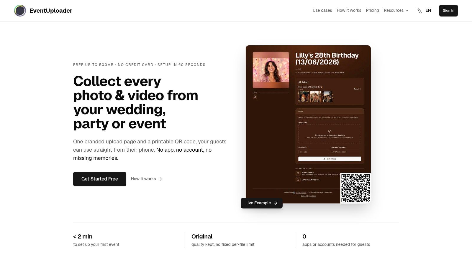
The cleanest setup is simple. Create one branded upload page, share one link or QR code, let guests send photos directly from their phones, moderate what comes in, and then publish selected images back to the same destination.
That matters because guests don't want a new app, a password maze, or a sign-up flow while they're standing at a table, in a crowd, or trying to catch a key moment. The fewer steps you add, the more likely people are to participate.
One tool built for this workflow is EventUploader. It lets organizers create a branded upload page, share it by link or QR code, collect photos and videos without requiring an app or account, manage uploads from a dashboard, and publish favorites to a shareable gallery on the same link guests already used.
Set up the page before the event starts
Treat this like event signage, not just web content.
Include your event name, a short welcome line, clear upload instructions, and brand elements that reassure people they're in the right place. For weddings and private celebrations, softer language works better. For conferences or festivals, direct language usually wins.
Use this setup checklist:
- Brand the page clearly: Add logo, colors, and a short message so the upload destination feels intentional.
- Keep instructions short: “Scan, choose photos, upload” is enough. Don't explain the entire system.
- Test the QR code physically: Print it and scan it from a few feet away before the event.
- Decide moderation rules early: Know whether uploads go live automatically or wait for review.
For mobile-first event collection tactics, this guide to mobile photo upload for events is worth reviewing because it focuses on the behavior of phone users, not desktop assumptions.
Publish back to the same place
This is the part people remember.
If guests upload to one link and then later have to hunt down a different album, engagement drops. Reusing the same destination removes confusion. People already know where to go.
After you've reviewed incoming content, publish a selection that reflects the event well. Keep the gallery tight. Include the obvious highlights, but also include enough candid moments to make the gallery feel communal rather than overly curated.
A quick demo helps if you're planning the flow with a team:
Privacy matters more here than in a public portfolio
Event galleries often include children, guests, and private moments. That puts privacy and retention on the table immediately.
Independent GDPR-focused guidance for online galleries stresses data-processing agreements, access controls, encryption, storage location, and deletion timelines, including examples of 6 to 12 month retention windows and explicit deletion rights in this GDPR gallery guidance. Even if you're not operating in a market where those rules apply directly, the principle is solid. Decide who can upload, who can view, how long the gallery stays available, and how removal requests are handled.
Guests are usually happy to share photos. They're much less happy when nobody told them how those photos would be stored, shared, or removed.
Making Your Gallery Fast Accessible and Search Friendly
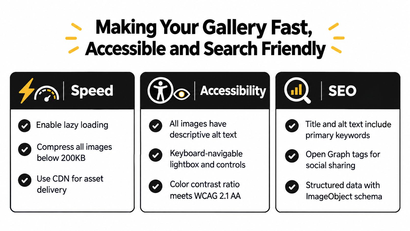
A gallery can look polished and still fail basic usability. This usually happens in three places at once. The page is heavy, the lightbox isn't keyboard-friendly, and the images are barely described.
Speed checks that matter
For image-heavy pages, aesthetics aren't the performance standard. Core Web Vitals are.
Independent benchmarking guidance points to Largest Contentful Paint as the key metric, with a target of 2.5 seconds or less, because gallery images are often the largest element on the page. It also sets Interaction to Next Paint at 200 ms or less for responsive interactions, especially important when galleries use scripts or lightboxes, as explained in this gallery performance guidance.
If your gallery feels slow, the fix is usually one of these:
- Your lead image is too heavy: Reduce file size or swap in a better-sized asset.
- The lightbox script is bloated: Remove visual extras and test a leaner implementation.
- Too many thumbnails load at once: Use lazy loading and paginate or split galleries where needed.
- Layout shift is happening: Reserve image space so the page doesn't jump as files load.
Accessibility goes beyond alt text
A surprising number of galleries still fail the basics.
Guidance for online image galleries emphasizes that users must be able to complete core tasks with keyboard-only navigation, maintain a visible focus state, and get meaningful alternative text for images. That aligns with government-standard usability principles and WCAG-based evaluation criteria described in this accessibility research on image galleries.
Test your gallery in this order:
- Tab through everything. Can you open, use, and close the gallery without a mouse?
- Watch the focus state. If you can't tell where you are, many users can't either.
- Check labels and buttons. “Close,” “Next image,” and “Previous image” should be explicit.
- Review alt text with context. Describe the image meaningfully when it adds information. Don't stuff keywords.
Search visibility follows good implementation
Search-friendly image galleries usually come from good fundamentals, not tricks.
Meaningful file names, sensible captions, clean page structure, and responsive images all help. So does surrounding the gallery with actual context instead of dropping it onto an empty page with no supporting text.
If image quality matters in your workflow, this guide on the best way to send photos without losing quality is a useful companion because file handling decisions upstream often affect what finally lands in the gallery.
If a gallery is fast only on desktop, accessible only with a mouse, and understandable only visually, it isn't finished.
Your Next Gallery Done Right
A gallery usually fails in familiar ways. The page looks good in the mockup, then real use exposes the gaps. Phone users wait on oversized images, keyboard users get trapped in the lightbox, and event guests have no clear path to add their own photos.
Good gallery work starts by defining the job.
A portfolio gallery needs tighter editing than many teams expect. Fewer images, clearer categories, and stronger sequencing usually outperform a long mixed grid. A standard website gallery should use the lightest setup the team can maintain. An event gallery has a different requirement entirely. It needs to collect uploads, handle sharing cleanly, and publish everything back to one place without turning the experience into a support problem.
Start smaller than you think. Build the first pass with a limited set of images, review it on a phone, test it with a keyboard, and watch where people hesitate. That early test catches more real issues than another round of visual polish.
The galleries that hold up are easy to update, easy to browse, and clear about what visitors can do next.
If you need more than a display grid, EventUploader gives you a practical way to collect guest photos and videos through one branded link or QR code, then publish them back to a shareable gallery on the same link. It fits the event workflow that many website gallery tools do not handle well. See how it works at EventUploader.